One brief note before we proceed; Adobe has tried to set up the RAW processor in a logical manner. For that reason, the tools you see on the right are arranged roughly in the order you should use them, starting with white balance and ending with saturation. You don't have to do them in this order, but it is a logical method.
White Balance
One of the very first things you will want to do in RAW is adjust the white balance. This is done with two different tools. The first is the plain eyedropper. You will notice the eyedropper is filled with gray liquid. This is because they do not want you to click it on something pure white, but on something neutral. I usually choose something just off the whitest part of the image, or a shaded white, like the bottom of a cloud or a shadow on a white shirt. Clicking on one of these areas will make an instant change and if you look to the left you will notice that the first two sliders have moved from zero to a new value.
These two sliders control the white balance. One for the warm/cool aspect of the white balance and the other for the green/magenta. When you clicked on the part of the image with the eyedropper, both of these values were adjusted so that the light would be chromatically neutral. However, there is nothing that says you have to stay with this setting. You may find that warming or cooling the image a bit makes an improvement and that is certainly your prerogative. I will tell you that I usually make big adjustments with the warm/cool and very tiny ones with the green/magenta.

Exposure
Above the sliders at the top/left you will see the images histogram. This is a graphical representation of the tonal values in the image. Each value is measured on a scale of 0 to 255 with 0 being pure black and 255 being pure white. Each channel (red, blue, green) is represented separately and overlapped. What we want to do with the exposure slider is move this graph so that the bottom of the curve just touches the right hand side. If most of your graph is to the left, you may have to push the slider a good deal to the right. If the graph is clipped on the right, try pushing the slider to the left; you may be surprised at the results. Often there is a great deal of image that can be rescued to the right; rarely is that so on the left. Don't worry about where the left side of the graph ends up. We want to extend it all the way to the left but we will be using a different slider for that.
Recovery
The next slider is marked "Recovery." Its purpose is to try to help salvage blown out highlights. If your graph is roughly where you want it and yet you still have some blown out highlights, you may find that pushing this slider to the right will rescue some of that highlight detail. I have had limited success with this slider, but there are times when it will absolutely save and image.
Fill Light
Fill is a wonder. Often when you adjust your graph parts of the image end up being darker than you wanted. The Fill slider will gently brighten these darker tones much as a fill light would but with a great deal more flexibility. Wonderful tool.
Blacks
I told you earlier that we would be adjusting the bottom of the graph with a different slider and this is the tool. We will be setting the black point by pushing this to the right. I also told you that we usually want to do these things in the order Adobe has given them to us, but this is an exception. Why would we want to adjust Recovery and Fill before setting the bottom of the graph? We wouldn't; so just this once, skip their recommendation and fix this before continuing on.

Brightness
Why do you need a brightness slider when you can brighten the image with the exposure slider? Because they work a bit differently. The brightness slider allows you to compress things at the light side of the image with pushing them into the blown out territory, at least not as much as using the exposure slider. If your graph looks good but your image looks a bit dingy try adjusting this.
Contrast
I recommend you leave this slider alone. It will adjust the overall image contrast and there may be times when that is called for, but most of the time our next slider does a much better job.
Clarity
The Clarity slider works by increasing mid tone contrast.You will find you can push it nearly all the way to the left and just keeps looking better all the way. Wonderful tool. When used in conjunction with the next two sliders it can really add some punch to your images.
Vibrance and Saturation
Vibrance and Saturation essentially do the same thing with one significant difference; Vibrance has built-in protection for skin tones; make that Caucasian skin tones. This allows you to boost the saturation in an image without making the skin tones look unnatural. Why only white skin tones? Is Adobe racist? No, you'll find you can boost darker skin tones a lot more without getting that funny orange color so it isn't really necessary, but for lighter skin tones it can be very helpful.
Personally, I love bright colors and I play with these tools a lot. I feel like I'm shooting Kodachrome again and I'm getting those bright saturated colors I've always loved. However, I have also taken Ansel Adams advice to "push it until it looks good, then back off a bit." (He was talking about his polarizing filter, but the principle is the same.)
By this time you may be exhausted from reading but you should also have a darned good looking image. There is more that can be done in RAW, but these are where the biggest changes are made and where, as I promised, you should be able to make an image that looks a whole lot better than the jpg your camera produces.

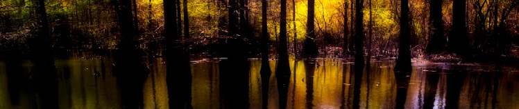
(Not my favorite image but it does a great job of illustrating the rather dramatic results possible with RAW processing.)